
Contents
2026 TREND GUIDE
By Bedroom Style Reviews Editorial Team
Colour is the most powerful and most affordable tool in the bedroom decorator’s toolkit — capable of transforming the emotional atmosphere of a room completely, making it feel larger or smaller, warmer or cooler, more energising or more restful. In 2026, a growing body of colour psychology and environmental psychology research has made it possible to choose bedroom colours based not just on personal aesthetic preference but on their genuine, scientifically understood effects on mood, anxiety, and sleep quality.
This guide covers the complete bedroom colour story for 2026 — from the psychological science of colour to the specific shades dominating the interior design landscape this year, with practical guidance on how to apply colour effectively through paint, textiles, and accessories.
❝ “Colour in the bedroom is not merely decorative. It is environmental — it shapes the psychological experience of being in the room, and through that experience, it affects sleep quality, morning mood, and daily wellbeing.” — Environmental Psychologist. ❞

PART 1: THE PSYCHOLOGY OF BEDROOM COLOUR
How Colour Affects the Brain and Body
Colour perception is processed by the visual cortex and simultaneously triggers responses in the limbic system — the brain’s emotional processing centre — and in the autonomic nervous system, which controls heart rate, breathing, and cortisol levels. This means that colour choices in the sleep environment are not merely aesthetic decisions but physiological ones, with measurable effects on arousal, relaxation, and sleep readiness.
Research across multiple disciplines — environmental psychology, colour science, and sleep medicine — has produced consistent findings on the broad categories of colour’s physiological effects. Cool, desaturated colours (soft blues, greens, lavenders, and greiges) consistently reduce physiological arousal, lower perceived heart rate, and promote relaxation. Warm, saturated colours (reds, oranges, bright yellows) consistently increase physiological arousal, raise perceived heart rate, and promote alertness. Neutral colours (whites, beiges, greys) have the least predictable psychological effects, varying significantly with the specific tone and the associated context of the colour.
Colour Saturation and Sleep
Beyond hue (the actual colour family), saturation — the intensity or purity of the colour — has a significant and somewhat independent effect on psychological arousal. Highly saturated colours create visual stimulation regardless of their hue; a highly saturated blue is more arousing than a muted, dusty blue, even though both are from the ‘calming’ cool colour family. In the bedroom, where promoting calm and reducing arousal is the primary design objective for the evening period, muted, desaturated versions of chosen hues are reliably preferable to their highly saturated equivalents.
PART 2: THE BEST BEDROOM COLOURS OF 2026
Earthy Terracotta and Clay: The Year’s Defining Colour
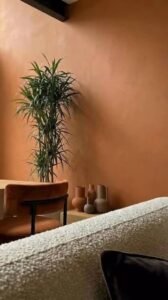
Terracotta — a warm, earthy reddish-orange derived from the colour of fired clay — is the defining bedroom wall colour of 2026. It combines the warmth and organic quality of an earth tone with a richness and depth that creates a distinctly cocoon-like atmosphere in the bedroom. Terracotta walls pair naturally with natural wood furniture, linen bedding in cream or warm white, rattan accessories, and warm-toned plants — creating the complete biophilic, earthy aesthetic that dominates 2026 interior design.
In psychological terms, terracotta’s warmth creates a feeling of physical safety and thermal comfort that is deeply restful. Its earthy quality — its connection to the natural landscape — activates the biophilic response that research consistently associates with reduced stress and improved wellbeing. For those concerned about terracotta’s potential for making a room feel warm or small, the key is in the tone selection: a muted, dusty terracotta with significant grey undertones feels far more spacious and calming than a bright, saturated version.
Sage Green: The Consistent Favourite
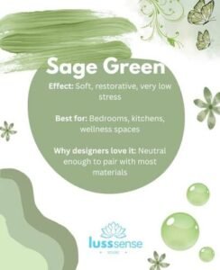
Sage green occupies a particularly fortunate position in the colour psychology of the bedroom — combining the universally calming properties of green (which research associates with restoration, nature connection, and reduced anxiety) with a muted, greyed quality that prevents the visual stimulation associated with more saturated greens. It also has exceptional chromatic versatility, pairing naturally with warm wood tones, white bedding, terracotta accents, and virtually every neutral palette.
In 2026, sage green continues to be one of the most frequently specified bedroom wall colours, and its sustained popularity reflects its genuine effectiveness rather than mere trendiness. It works at every scale — from a large master bedroom where it creates a serene, enveloping atmosphere, to a small bedroom where it provides character and warmth without making the space feel smaller. A matte or eggshell finish in sage green will always outperform a satin or gloss finish in the bedroom, as the lower reflectivity creates a more restful visual quality.
Deep Forest Green: The Dramatic Statement
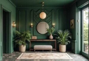
For those who want more intensity in their bedroom colour scheme, deep forest green is one of 2026’s most compelling choices. Applied to all four walls — or just the feature wall behind the bed — a deep, saturated forest green creates an enveloping, dramatic atmosphere that is simultaneously intense and restful. It works particularly well in rooms with natural wood flooring and white or cream bedding, and the contrast between the deep walls and the bright bedding is one of the year’s most striking bedroom aesthetics.
Warm Dusty White and Cream: The Timeless Foundation
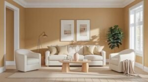
Not every bedroom needs an assertive colour statement. Warm white, cream, and off-white remain among the most enduringly beautiful bedroom colours because they reflect natural light generously, pair with virtually every other colour and material, and provide a calm, clear backdrop that allows the room’s other elements — bedding textures, wood grains, plant forms, artwork — to be fully appreciated without colour competition.
In 2026, the critical distinction within the white-cream spectrum is between cool whites (which can feel clinical and cold, particularly in rooms without strong natural light) and warm whites (which contain subtle yellow, pink, or grey undertones that create a genuinely inviting atmosphere). The warm-white family — bone, linen, cream, and warm greige — is far more universally successful in the bedroom context than pure white.
Midnight Blue and Deep Navy
Deep blue bedroom walls — particularly midnight navy with a slightly green or purple undertone — are experiencing a strong moment in 2026 bedroom design, driven by their association with night skies, depth, and the physiological calming effect of deep cool tones. Midnight blue creates a bedroom atmosphere that feels both luxurious and intimate — particularly effective in rooms where the evening and night use of the space is more important than its daytime function. It pairs exceptionally well with warm brass and gold hardware details, which provide bright contrast against the deep background.
PART 3: COLOUR APPLICATION TECHNIQUES
The Feature Wall: Maximum Impact, Minimum Commitment
A feature wall — a single wall painted in a contrasting or more assertive colour than the remaining three walls — is the bedroom colour strategy for those who want visual drama without fully committing to a whole-room colour scheme. In 2026, the feature wall is almost always the wall behind the bed (the headboard wall), as this is the room’s natural focal point and the wall that benefits most from having a stronger colour that frames and emphasises the bed and its headboard.
For maximum impact, the feature wall colour should be notably darker or more saturated than the other three walls,s rather than merely slightly different. A wall that is only marginally different from its surroundings reads as a mistake rather than a decision. Bold contrast — cream walls with a deep terracotta feature, white walls with a forest green feature, and greige walls with a deep charcoal feature — reads as intentional, confident, and decisive.
The Drenched Room
The drenched room approach — applying the same colour to all four walls and the ceiling — is 2026’s most discussed and most widely adopted bedroom colour technique, generating extraordinary before-and-after imagery on design platforms. It creates a sense of complete immersion in the chosen colour that is impossible to achieve when the ceiling remains white, and produces a cocoon-like atmosphere that many people describe as the most restful sleep environment they have experienced.
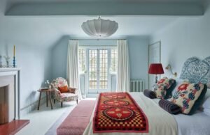
The drenched room works particularly well with mid-tone and deep colours — terracotta, sage green, forest green, midnight blue, warm charcoal. Very pale colours, when used for the drenched room approach, can produce a slightly clinical or flat result if not offset with strong textural and material contrasts. The formula for a successful drenched room is: strong wall-and-ceiling colour + bright, contrasting bedding + warm, layered lighting + natural materials and textures.
The Two-Tone Bedroom: Upper and Lower Zones
A two-tone colour scheme that divides the walls horizontally — a dado rail or a painted line at approximately waist height separating a deeper lower half from a lighter upper half — is one of 2026’s more innovative bedroom colour approaches. The lower half in a deeper, richer colour grounds the room visually and creates a sense of solidity and warmth, while the lighter upper half and ceiling maintain a sense of openness and height. This approach allows the use of deeper, bolder colours in the bedroom while managing the potentially space-reducing effect of very dark walls in smaller rooms.
PART 4: COLOUR AND SLEEP SCIENCE — WHAT THE RESEARCH SHOWS
The Best Colours for Sleep Quality
Research conducted by Travelodge UK — involving analysis of sleep quality data from over a thousand participants sleeping in rooms of different colours — produced findings that align consistently with the broader colour psychology literature. Blue rooms produced the longest sleep duration and highest reported sleep quality. Green and yellow rooms were second-tier performers. Red rooms consistently produced the shortest sleep duration and lowest sleep quality. Grey rooms, while neutral in most respects, were associated with increased feelings of depression and poor morning mood.
The practical 2026 implication of this research is to prioritise muted, desaturated cool-to-neutral tones in the bedroom — soft blues, sage greens, warm greys, cream, and dusty lavender — for the most sleep-supportive colour environment. Bright reds, vivid oranges, and highly saturated warm colours are best reserved for rooms where activating energy rather than promoting rest is the design goal. Terracotta, while warm, is sufficiently muted and earthed in most of its 2026 formulations to avoid the sleep-disrupting arousal associated with brighter, more saturated warm tones.
© 2026 bedroomstylereviews.com — All Rights Reserved
Affiliate Disclosure: We earn commission from qualifying Amazon purchases. All opinions are our own.

Dan is the founder and head content creator at Bedroom Style Reviews.
He has been working as a professional online product reviewer since 2015 and was inspired to start this website when he ended up sleeping on a memory foam mattress that was too soft and gave him backache.
Through in-depth research and analysis, Dan’s goal with this website is to help others avoid such pitfalls by creating the best online resource for helping you find your ideal mattress, bedding, and bedroom furniture.
Dan is a qualified NVQ Level 2 Fitness Instructor with 6 years’ experience helping clients improve their health through diet, exercise, and proper sleep hygiene.
He also holds several college and university-level qualifications in health sciences, psychology, mathematics, art, and digital media creation – which helps him to publish well researched and informative product reviews as well as articles on sleep, health, wellbeing, and home decor.
Dan also has direct personal experience with insomnia, anxiety, misophonia (hypersensitivity to sounds), and pain from both acute and long-standing sporting injuries – he enjoys writing insightful articles around these subjects to help fellow sufferers of such conditions.
Learn more about Dan here.